Quantcast
Channel: blue – edjelley.com – Fountain Pen, Ink, and Stationery Reviews
Viewing all 17 articles
Browse latest View live

Noodler’s Bad Blue Heron – Handwritten Ink Review

$
0
0

Noodler's Bad Blue Heron Handwritten Review - 1

Pen: Lamy Al-Star, Broad Nib
Ink: Noodler’s Bad Blue Heron
Paper: Rhodia dotPad, No.16

Notes:  Noodler’s Bad Blue Heron was one of the first inks I tried out when I got my first Safari. The ink introduced me to what a fountain pen ink could really be. The ink exhibits great shading properties, it’s practically bulletproof, and is a unique shade of blue. It’s borderline blue-black, but with the shading, there are lighter highlights that stand out, making this ink a pleasure to look at. Bad Blue Heron not only looks great, but it is an absolute pleasure to write with. This is probably the best flowing and the best lubricated ink I own. It’s a dream to write with in my Binderized Pilot Vanishing Point Medium Nib, and can be seen in that review. It is usually in at least one of my daily carry pens as well. The only “downside” to this ink is that with most of the pens I have tried it in, there is a considerable amount of nib creep. This bothers some people, but I don’t mind it. Other than that, there isn’t really anything else I can say that’s bad about this ink. If there was one ink I would recommend, it would be this one. The shade of blue is perfect for everyday writing, but the shading properties make it less boring than a normal blue. Definitely add this stuff to your next sample haul.

Enjoy the reivew, I really love this ink.

Noodler's Bad Blue Heron - Handwritten Review - Page 1

Noodler's Bad Blue Heron - Handwritten Review - Page 2

Noodler's Bad Blue Heron Handwritten Review

The Lamy broad nib + Noodler’s BBH = heaven. It lays down a nice, wet line with great shading.

Noodler's Bad Blue Heron Handwritten Review

make it shade.

Noodler's Bad Blue Heron Handwritten Review

This ink can practically be layered. It’s fun to draw with, it gets darker the more you use.

Noodler's Bad Blue Heron - Handwritten Review - Page 1 Noodler's Bad Blue Heron - Handwritten Review - Page 2 Noodler's Ink Bad Blue Heron Review Handwritten 2 Noodler's Bad Blue Heron Review Handwritten 1 Noodler's Bad Blue Heron - Handwritten Review - Make it Shade. Noodler's Bad Blue Heron - Handwritten Review - Passes Noodler's Bad Blue Heron - Handwritten Review - Writing Close Up Noodler's Ink Bad Blue Heron Review Handwritten 4


Noodler’s Baystate Blue – Ink Review

$
0
0

Noodler's Baystate Blue Fountain Pen Ink ReviewNoodler’s Ink – Baystate Blue

Handwritten Review

PenNoodler’s Ahab Flex in Medieval Lapis
Ink: Noodler’s Baystate Blue
Paper: Kyokuto FOB COOP Dot Grid – B5 (Available at JetPens.com)

Notes:
Well…the infamous Noodler’s Baystate Blue…here it is. Noodler’s Baystate Blue has obtained a spot as one of the worst-behaving, pen-destroying inks out there. It eats vintage ink sacs, melts Pilot feeds, and turns any demonstrator you have into a blue pen. With that being said, it’s one of the most vibrant, saturated, and bright inks I have ever used.  With all of the problems commonly associated with the ink, I decided to fill up my unruly Noodler’s Ahab. For some reason, two negatives make a positive here. The ink writes smoothly, and flows nicely in the Ahab. Adding some flex to the written line doesn’t make the ink shade, I suspect due to it’s high level of saturation. Writing normally is smooth and consistent though. The ink does manage to bleed through just about every paper I use it on, so every day practicality is at a minimum. If you like the color (which many do, myself included) I would suggest dedicating a cheap pen to the ink. On the positive side, it’s super vibrant, and smooth. On the negative side it feathers, bleeds, and eats pens. Proceed at your own risk when trying this ink!!! Also, huge thanks to Peter for sending me the bottle!

Pros:

  • Super vibrant.
  • Very Smooth
  • Super Saturated

Cons:

  • Destroys pens
  • Stains everything
  • Lots of feathering and bleed through, even on good paper
  • Long dry time

Ink Review good lighting 3

Ink Review good lighting 4

Noodler's Baystate Blue Fountain Pen Ink Review

Noodler's Baystate Blue Fountain Pen Ink Review

Noodler's Baystate Blue Fountain Pen Ink Review

Noodler's Baystate Blue Fountain Pen Ink Review

Noodler's Baystate Blue Fountain Pen Ink Review

Noodler's Baystate Blue Fountain Pen Ink Review

Noodler's Baystate Blue Fountain Pen Ink Review

Gallery:

Ink Review good lighting 3 Ink Review good lighting 4 Noodler's Baystate Blue Fountain Pen Ink Review Noodler's Baystate Blue Fountain Pen Ink Review Noodler's Baystate Blue Fountain Pen Ink Review Noodler's Baystate Blue Fountain Pen Ink Review Noodler's Baystate Blue Fountain Pen Ink Review Noodler's Baystate Blue Fountain Pen Ink Review Noodler's Baystate Blue Fountain Pen Ink Review

Related Reading:


De Atramentis Plum – Ink Review

$
0
0

De Atramentis Plum Fountain Pen Ink ReviewDe Atramentis Plum
Fountain Pen Ink

Handwritten Review

PenSailor Magellan Demonstrator – Medium nib
Ink: De Atramentis Plum Scented Ink
Paper: Kyokuto F.O.B. COOP Dot Grid in B5

Notes: Wow…Finally a De Atramentis ink that I actually really like! I wish the rest of their line performed as well as this one does. No feathering or bleeding, and it’s just the right amount of wetness. The color is like a darker Iroshizuku Ku-Jaku, which I really like. I only wish the Ku-Jaku was a bit darker, but the De Atramentis Plum definitely fills that void. This is a scented ink, but the pleasant plum scent is really only noticeable when filling the pen from the bottle, of if you get dangerously close to the feed. To me, the scented ink thing is kind of gimmicky, but I guess if you were using a dip pen and had a open ink well, it could add to the experience. The smell doesn’t affect the performance, which once again is really great. The ink shades really nicely, from a light turquoise to a deep blue-green. Make sure you click on the images and blow them up to full size, it’s really nice to look at. I was expecting some purples, because that’s typically what I think of when I hear the word “plum”, but not here. If you’ve had less than enjoyable experiences with De Atramentis ink before (I’m looking at you, Oriental Red), check this one out. You won’t be disappointed. Oh yeah, and thanks to Azizah over at Gourmet Pens for sending over the sample!

Thanks for reading and enjoy the pictures!

Pros:

  • Smooth
  • Well-behaved
  • Great color
  • Scented

Cons:

  • The scent is there, but it’s hard to detect

De Atramentis Plum Fountain Pen Ink Review

De Atramentis Plum Fountain Pen Ink Review

De Atramentis Plum Fountain Pen Ink Review

De Atramentis Plum Fountain Pen Ink Review

De Atramentis Plum Fountain Pen Ink Review

De Atramentis Plum Fountain Pen Ink Review

De Atramentis Plum Fountain Pen Ink Review

De Atramentis Plum Fountain Pen Ink ReviewGallery: De Atramentis Plum Fountain Pen Ink Review De Atramentis Plum Fountain Pen Ink Review De Atramentis Plum Fountain Pen Ink Review De Atramentis Plum Fountain Pen Ink Review De Atramentis Plum Fountain Pen Ink Review De Atramentis Plum Fountain Pen Ink Review De Atramentis Plum Fountain Pen Ink Review De Atramentis Plum Fountain Pen Ink Review De Atramentis Plum Fountain Pen Ink Review


P.W. Akkerman Shocking Blue – Ink Review

$
0
0

P.W. Akkerman Shocking Blue Fountain Pen Ink Review

P.W. Akkerman
Shocking Blue
Fountain Pen Ink

Handwritten Review

PenLamy Safari, Fine Nib
Ink: P.W. Akkerman Shocking Blue
Paper: Kyokuto F.O.B. COOP Dot Grid – B5 size

Notes: Here’s another ink from P.W. Akkerman that I happen to like quite a bit. Shocking Blue isn’t really all that shocking (when compared to Noodler’s Baystate Blue), but it is a great medium blue with some nice subtle shading. Typically I use darker blue-blacks, or lighter blues like Iroshizuku Kon-Peki or Sheaffer Peacock, but this ink is making me want to explore that middle ground a little more. It’s exceptionally smooth in this Lamy fine nib, I’m really enjoying the combo. The major downside to this ink is the availability in the United States. It’s hard to find, and it usually ends up costing around $24.00 per bottle, plus international shipping from Europe. It’s recommended that you buy 3 at a time so the shipping is affordable. That adds up to around a $100 ink purchase. On the plus side, the bottles are huge and look really cool. Hopefully a pen shop in the US starts distributing this ink soon, because the two I’ve tried so far have been great. I won’t be buying a bottle of it, but Shocking Blue has started a search for a readily-available alternative.

UPDATE: This ink was kind of tough to clean out of the Safari I had it in, your mileage may vary though. No staining of anything, just lots of flushing needed to get it out.

Huge thanks AGAIN to Azizah over at Gourmet Pens for sending me the sample!

Thanks for reading and enjoy the pictures!

Pros:

  • Nice Medium Blue
  • Subtle Shading
  • Good performance in Field Notes

Cons:

  • No U.S. distributor…yet
  • Price of shipping

P.W. Akkerman Shocking Blue Fountain Pen Ink Review

P.W. Akkerman Shocking Blue Fountain Pen Ink Review

P.W. Akkerman Shocking Blue Fountain Pen Ink Review

P.W. Akkerman Shocking Blue Fountain Pen Ink Review

P.W. Akkerman Shocking Blue Fountain Pen Ink Review

P.W. Akkerman Shocking Blue Fountain Pen Ink Review

P.W. Akkerman Shocking Blue Fountain Pen Ink Review

P.W. Akkerman Shocking Blue Fountain Pen Ink ReviewGallery: P.W. Akkerman Shocking Blue Fountain Pen Ink Review P.W. Akkerman Shocking Blue Fountain Pen Ink Review P.W. Akkerman Shocking Blue Fountain Pen Ink Review P.W. Akkerman Shocking Blue Fountain Pen Ink Review P.W. Akkerman Shocking Blue Fountain Pen Ink Review P.W. Akkerman Shocking Blue Fountain Pen Ink Review P.W. Akkerman Shocking Blue Fountain Pen Ink Review P.W. Akkerman Shocking Blue Fountain Pen Ink Review P.W. Akkerman Shocking Blue Fountain Pen Ink Review


Related Reading:


Diamine Aqua Blue – Ink Review

$
0
0

Diamine Aqua Blue
Ink Review

PenHero 9018 Fude Nib
Ink: Diamine Aqua Blue
Paper: Kyokuto F.O.B. COOP B5 Dot Grid

Pros:

  • Reminds me of Sheaffer Peacock Blue
  • Beautiful shading
  • Great flow
  • I want to swim in it

Cons:

  • None!

Notes:
This one is a real winner. The awesome shading, great flow, and best of all, it reminds me of Sheaffer Peacock Blue (discontinued). This pen and ink combo is pretty awesome too. The wet fude nib really shows off the shading capability of the ink. Another positive for me is the brand, Diamine, which happens to be my favorite ink manufacturer. There is really nothing bad I can say about this ink at all, I love it. If you’re searching for a great turquoise, or a replacement for the now discontinued Peacock Blue, don’t sleep on this one. Thanks again again again to Azizah over at Gourmet Pens for sending this one over in the giant sample package she sent.

Thanks for reading and enjoy the review!

Diamine Aqua Blue Fountain Pen Ink Review

Diamine Aqua Blue Fountain Pen Ink Review

Diamine Aqua Blue Fountain Pen Ink Review

Diamine Aqua Blue Fountain Pen Ink Review

Diamine Aqua Blue Fountain Pen Ink Review

Diamine Aqua Blue Fountain Pen Ink Review

Diamine Aqua Blue Fountain Pen Ink Review

Diamine Aqua Blue Fountain Pen Ink Review

Diamine Aqua Blue Fountain Pen Ink Review

Diamine Aqua Blue Fountain Pen Ink Review

Diamine Aqua Blue Fountain Pen Ink Review

Diamine Aqua Blue Fountain Pen Ink Review


Gallery: Diamine Aqua Blue Fountain Pen Ink Review Diamine Aqua Blue Fountain Pen Ink Review Diamine Aqua Blue Fountain Pen Ink Review Diamine Aqua Blue Fountain Pen Ink Review Diamine Aqua Blue Fountain Pen Ink Review Diamine Aqua Blue Fountain Pen Ink Review Diamine Aqua Blue Fountain Pen Ink Review Diamine Aqua Blue Fountain Pen Ink Review Diamine Aqua Blue Fountain Pen Ink Review Diamine Aqua Blue Fountain Pen Ink Review Diamine Aqua Blue Fountain Pen Ink Review Diamine Aqua Blue Fountain Pen Ink Review

Related Reading:


Noodler’s Navy – Ink Review

$
0
0

Noodler’s Ink – Navy

Handwritten Review

PenPilot Metropolitam, Medium Nib
Ink: Noodler’s Navy
Paper: Kyokuto FOB COOP Dot Grid – B5 (Available at JetPens.com)

Notes:
Another day, another ink from Noodler’s. This offering is a medium-dark shade of blue that exhibits some nice shading properties, ranging from a light turquoise to a dark blue. It reminds me a bit of De Atramentis’ Plum, but without the green tone. When I think of Navy blue, this is not the color that comes to mind. I was expecting a dark blue with a bit of grey in it, like Diamine Midnight or Noodler’s 54th Massachusetts. The ink performs well, flowing effortlessly from the Metropolitan’s medium nib. Lubrication and smoothness are on point with what’s expected, but overall I’m not blown away by the color. There are other blue inks that I like more that I already have in my collection, but Noodler’s Navy is by no means bad. Just be aware that you’re not going to get that deep dark blue that comes to mind when you hear “Navy” blue.

Pros:

  • Awesome blue to turquoise shading
  • Smooth
  • Noodler’s inks are a great value

Cons:

  • The name doesn’t really fit the color

Noodler's Navy Fountain Pen Ink Review Noodler's Navy Fountain Pen Ink Review Noodler's Navy Fountain Pen Ink Review Noodler's Navy Fountain Pen Ink Review Noodler's Navy Fountain Pen Ink Review Noodler's Navy Fountain Pen Ink Review Noodler's Navy Fountain Pen Ink Review Noodler's Navy Fountain Pen Ink Review Noodler's Navy Fountain Pen Ink Review Noodler's Navy Fountain Pen Ink Review Noodler's Navy Fountain Pen Ink ReviewGallery:
Noodler's Navy Fountain Pen Ink Review Noodler's Navy Fountain Pen Ink Review Noodler's Navy Fountain Pen Ink Review Noodler's Navy Fountain Pen Ink Review Noodler's Navy Fountain Pen Ink Review Noodler's Navy Fountain Pen Ink Review Noodler's Navy Fountain Pen Ink Review Noodler's Navy Fountain Pen Ink Review Noodler's Navy Fountain Pen Ink Review Noodler's Navy Fountain Pen Ink Review Noodler's Navy Fountain Pen Ink Review


Diamine Registrar’s Ink – Review

$
0
0

Diamine Registrar’s
Ink Review

PenLamy Accent, 1.1mm Stub
Ink: Diamine Registrar’s (Iron Gall)
Paper: Kyokuto F.O.B. COOP B5 Dot Grid

Pros:

  • Nice shading
  • Iron Gall permanence
  • Behaves well on cheap paper
  • Archival (until it burns through the paper in 500 years)

Cons:

  • Writes very dry
  • Can’t be left in a pen unattended for too long

Notes:
At the time of writing, I was on a bit of an Iron Gall kick. First I fell in love with Rohrer & Klingner Scabiosa, now I’m enjoying the Registrar’s, and I have a sample vial of R&K Salix waiting to be loaded up. The most interesting thing about this ink is how it dries from a pale dusty blue to a deep blue-black as the ink oxidizes. The ink comes out of the pen as a light blue with some nice shading, check back in 24 hours and it’s super dark. The ink behaves well on the Kyokuto paper, Rhodia, copy paper, and Field Notes. It’s a great ink to have around due to it’s versatility. I’ve really been enjoying watching the transition from light blue to near-black. My only issue with the ink is how dry it writes. This would be best suited in a wet flowing pen. Overall, I think the positives outweigh the negatives. The real test is going to be how the Diamine holds up to Rohrer & Klingner’s blue iron gall offering.

Thanks for reading and enjoy the review!

Diamine Registrar's Ink Fountain Pen Ink Review

The difference between fresh ink, and ink at 4 days is pretty awesome. You can clearly see that it’s darkened up quite a bit.

Diamine Registrar's Ink Fountain Pen Ink Review Diamine Registrar's Ink Fountain Pen Ink Review Diamine Registrar's Ink Fountain Pen Ink Review Diamine Registrar's Ink Fountain Pen Ink Review Diamine Registrar's Ink Fountain Pen Ink Review Diamine Registrar's Ink Fountain Pen Ink Review Diamine Registrar's Ink Fountain Pen Ink Review Diamine Registrar's Ink Fountain Pen Ink Review Diamine Registrar's Ink Fountain Pen Ink Review Diamine Registrar's Ink Fountain Pen Ink Review Diamine Registrar's Ink Fountain Pen Ink Review Diamine Registrar's Ink Fountain Pen Ink Review


Gallery:
Diamine Registrar's Ink Fountain Pen Ink Review Diamine Registrar's Ink Fountain Pen Ink Review Diamine Registrar's Ink Fountain Pen Ink Review Diamine Registrar's Ink Fountain Pen Ink Review Diamine Registrar's Ink Fountain Pen Ink Review Diamine Registrar's Ink Fountain Pen Ink Review Diamine Registrar's Ink Fountain Pen Ink Review Diamine Registrar's Ink Fountain Pen Ink Review Diamine Registrar's Ink Fountain Pen Ink Review Diamine Registrar's Ink Fountain Pen Ink Review Diamine Registrar's Ink Fountain Pen Ink Review Diamine Registrar's Ink Fountain Pen Ink Review Diamine Registrar's Ink Fountain Pen Ink Review

Related Reading:


Private Reserve Orange Crush Ink Review

$
0
0

Private Reserve
Orange Crush
Ink Review

PenKaras Kustoms Ink – Medium Nib
Ink: Private Reserve Orange Crush
Paper: Rhodia No. 16 Blank with a sheet of Doane Paper underneath for guides.

Pros:

  • Not too bright to write with
  • Nice mild shading
  • Good flow
  • Writes smooth

Cons:

  • It’s orange. I still don’t like orange.

Notes:
This is the physically largest ink review I’ve done, being that it’s on a Rhodia No. 16 pad. I decided to try something new (and give myself some more room on the page) by placing a sheet from my Doane Writing Pad underneath some blank Rhodia. So let’s see how it goes. I feel like I’ve missed some sort of pen blogger rite of passage where they were all initiated into the world of loving the color orange. I’m really not a huge fan of the color, pretty much anywhere. That being said, Private Reserve’s Orange Crush is a nice looking ink. There’s some nice mild shading in the Karas Ink’s medium nib, but it’s nowhere the full on shading assault that’s seen with Noodler’s Apache Sunset. P.R. Orange Crush is a bit darker, and a tiny bit more muted than Apache Sunset, and with far less yellow. It’s somewhere between the muted Noodler’s Cayenne and everyone’s favorite Apache Sunset. The more I’m writing with the ink, the more I’m noticing it’s a bit dry. It’s not bad, but I prefer the performance of Noodler’s Cayenne which is very close in appearance. If you like the color of this ink, it doesn’t disappoint, but I personally prefer Noodler’s orange offerings. Make sure to do some sampling before committing to a full bottle!

Thanks for reading and enjoy the review!

Private Reserve Orange Crush Ink Review

Private Reserve Orange Crush Ink Review Private Reserve Orange Crush Ink Review Private Reserve Orange Crush Ink Review Private Reserve Orange Crush Ink Review Private Reserve Orange Crush Ink Review Private Reserve Orange Crush Ink Review Private Reserve Orange Crush Ink Review Private Reserve Orange Crush Ink Review
Gallery:
Private Reserve Orange Crush Ink Review Private Reserve Orange Crush Ink Review Private Reserve Orange Crush Ink Review Private Reserve Orange Crush Ink Review Private Reserve Orange Crush Ink Review Private Reserve Orange Crush Ink Review Private Reserve Orange Crush Ink Review Private Reserve Orange Crush Ink Review Private Reserve Orange Crush Ink Review


Wahl Eversharp Wahlberry Ink Review

$
0
0

Wahl Eversharp
Wahlberry
Ink Review

PenLevenger L-Tech Stealth, Medium Nib
Ink: Wahl Eversharp Wahlberry
Paper: Rhodia No. 16 Blank with a sheet of Doane Paper underneath for guides.

Pros:

  • Nice medium blue
  • Very smooth

Cons:

  • Not very unique

Notes:
I had to do some digging around to get more info on this ink. Big thanks to Cary over at FountainPenDay.org for sending me over a sample! Wahlberry was the first of two inks released by Wahl-Eversharp over the summer. It’s advertised as an easy-flowing, fast-drying, non-clogging, smooth writing ink that’s ideal for their new line of flex nib pens. They say it’s safe specifically for older and vintage pens as well. I haven’t had it loaded up long enough to test all the claims (at the time of review), but it is very smooth and it is easy flowing. Theres some mild shading that I’m sure would pop more had I loaded it into a flex nib. The ink isn’t particularly unique, as it falls toward the darker end of medium blue, but it’s a solid performer at a reasonable price from a trusted brand. I have to get around to checking this stuff out in a flex nib and see what it’s really capable of. I like the ink, but there are so many blues out there that I’m not sure this is one I’d end up with a bottle of.

Thanks for reading and enjoy the review!

Wahl Eversharp Wahlberry Fountain Pen Ink Review Wahl Eversharp Wahlberry Fountain Pen Ink Review Wahl Eversharp Wahlberry Fountain Pen Ink Review Wahl Eversharp Wahlberry Fountain Pen Ink Review Wahl Eversharp Wahlberry Fountain Pen Ink Review Wahl Eversharp Wahlberry Fountain Pen Ink Review Wahl Eversharp Wahlberry Fountain Pen Ink Review Wahl Eversharp Wahlberry Fountain Pen Ink Review Wahl Eversharp Wahlberry Fountain Pen Ink Review Wahl Eversharp Wahlberry Fountain Pen Ink Review
Gallery:
Wahl Eversharp Wahlberry Fountain Pen Ink Review Wahl Eversharp Wahlberry Fountain Pen Ink Review Wahl Eversharp Wahlberry Fountain Pen Ink Review Wahl Eversharp Wahlberry Fountain Pen Ink Review Wahl Eversharp Wahlberry Fountain Pen Ink Review Wahl Eversharp Wahlberry Fountain Pen Ink Review Wahl Eversharp Wahlberry Fountain Pen Ink Review Wahl Eversharp Wahlberry Fountain Pen Ink Review Wahl Eversharp Wahlberry Fountain Pen Ink Review Wahl Eversharp Wahlberry Fountain Pen Ink Review


Rohrer & Klingner Salix Iron Gall – Ink Review

$
0
0

Rohrer & Klingner Salix

Fountain Pen Ink Review

PenLamy 2000, Binderized Medium Nib
Ink: Rohrer & Klingner Salix
Paper: Kyokuto F.O.B. COOP – Dot Grid – B5

Notes: This is the blue iron gall ink offering from Rohrer & Klingner, and I think it’s pretty awesome. It’s a solid performer on all  types of paper I’ve tried it with (even cheap copy paper). It’s a well-behaved ink that could be easily used as a daily driver due to it’s versatility. The ink shades wonderfully and it’s super smooth in my Lamy 2000. This particular iron gall does on lighter initially than Diamine’s Registrar’s Ink. Shading is about the same though. As with all iron gall inks, they darken up a bit as they dry, while permanently bonding with the paper in the process. I was a big fan of R&K Scabiosa (I recently bought an entire bottle), and now I can add Salix to the want list. Like all iron gall inks, try not to leave it loaded in a pen too long, as they can become corrosive over extended periods of time. I’ve never had an issue, but it’s definitely something to keep an eye on. I’m really loving this ink though, and I think I may need to add a bottle to my collection. Thanks for reading!

Pros:

  • Smooth
  • Awesome shading
  • Great on cheap paper
  • Iron gall permanence!

Cons:

  • None!

Rohrer & Klingner Salix Iron Gall Fountain Pen Ink Review Rohrer & Klingner Salix Iron Gall Fountain Pen Ink Review Rohrer & Klingner Salix Iron Gall Fountain Pen Ink Review Rohrer & Klingner Salix Iron Gall Fountain Pen Ink Review Rohrer & Klingner Salix Iron Gall Fountain Pen Ink Review Rohrer & Klingner Salix Iron Gall Fountain Pen Ink Review Rohrer & Klingner Salix Iron Gall Fountain Pen Ink Review Rohrer & Klingner Salix Iron Gall Fountain Pen Ink Review

Gallery:

Rohrer & Klingner Salix Iron Gall Fountain Pen Ink Review Rohrer & Klingner Salix Iron Gall Fountain Pen Ink Review Rohrer & Klingner Salix Iron Gall Fountain Pen Ink Review Rohrer & Klingner Salix Iron Gall Fountain Pen Ink Review Rohrer & Klingner Salix Iron Gall Fountain Pen Ink Review Rohrer & Klingner Salix Iron Gall Fountain Pen Ink Review Rohrer & Klingner Salix Iron Gall Fountain Pen Ink Review Rohrer & Klingner Salix Iron Gall Fountain Pen Ink Review Rohrer & Klingner Salix Iron Gall Fountain Pen Ink Review

Pilot Iroshizuku Tsuki-Yo Fountain Pen Ink – Review

$
0
0

Pilot Iroshizuku Tsuki-Yo

-Handwritten Review-

Specs:

Pilot Iroshizuku Tsuki-yo Fountain Pen Ink Review

Review Supplies:

Notes:

No surprise here, another well-performing, beautiful ink from the Iroshizuku line. Tsuki-Yo (Moonlit Night) is a great shade of medium blue with a tiny hint of green in it. It has some nice high contrasting shading going on in this 1.5mm stub, and I really want to put it in a flex nib. It could easily be used as an everyday ink, as it’s not too crazy a shade, and it is relatively conservative. As with all of the Iroshizuku inks, it comes in a great looking box and an even better looking bottle. It’s so hard to not love these inks, the only thing getting in the way of me owning the entire collection is the price. They’re a bit pricey at $28.00/bottle (50ml), but I really enjoy them as a display piece. I have yet to go through an entire bottle of any ink, so they should last a very long time. Tsuki-Yo is has great flow, is nice and wet in the 1.5mm stub. It’s not too dry or too wet, and performs well on most paper. I really love this ink, and I’m glad I have a bottle now. Huge thanks to my friends over at JetPens for sending the bottle over for review!

JetPens-Sponsored-Blog-Banner

Check out JetPens for tons of awesome Japanese pens and stationery. Free shipping on orders over $25, and hitting that is pretty easy with all the great stuff they have. So thanks again!

Pilot Iroshizuku Tsuki-yo Fountain Pen Ink Review Pilot Iroshizuku Tsuki-yo Fountain Pen Ink Review Pilot Iroshizuku Tsuki-yo Fountain Pen Ink Review Pilot Iroshizuku Tsuki-yo Fountain Pen Ink Review Pilot Iroshizuku Tsuki-yo Fountain Pen Ink Review Pilot Iroshizuku Tsuki-yo Fountain Pen Ink Review Pilot Iroshizuku Tsuki-yo Fountain Pen Ink Review Pilot Iroshizuku Tsuki-yo Fountain Pen Ink Review Pilot Iroshizuku Tsuki-yo Fountain Pen Ink Review Pilot Iroshizuku Tsuki-yo Fountain Pen Ink Review


J. Herbin Bleu Pervenche – Ink Review

$
0
0

J. Herbin Bleu Pervenche
Fountain Pen Ink Review

PenPilot Vanishing Point, Medium Nib
Ink: J. Herbin Bleu Pervenche
Paper: Kyokuto F.O.B. COOP – Dot Grid – B5

Notes:

When I saw that J. Herbin now offers small sample size bottles, I had to jump at it! Thanks to JetPens for sending over the bottle for review! As vibrant and nice as the color is, the performance of the ink is rather poor. The wet flow writes nicely, but results in some pretty bad feathering and bleed through. I haven’t had this issue with other J. Herbin inks, making this atypical. There are plenty of other blues out there, lots very similar. Unfortunately, I’d recommend passing on this one. If you like what you see and you absolutely have to have it, it does work well on Rhodia paper.

JetPens BannerCheck out JetPens for tons of awesome Japanese pens and stationery. Free shipping on orders over $25, and hitting that is always an easy task!

Pros:

  • Nice vibrant shade
  • Generous flow
  • Nice light to dark blue shading

Cons:

  • Only performs well on Rhodia paper
  • Lots of feather and bleed

J. Herbin Bleu Pervenche Fountain Pen Ink Review-1J. Herbin Bleu Pervenche Fountain Pen Ink Review-5J. Herbin Bleu Pervenche Fountain Pen Ink Review-2J. Herbin Bleu Pervenche Fountain Pen Ink Review-3J. Herbin Bleu Pervenche Fountain Pen Ink Review-4J. Herbin Bleu Pervenche Fountain Pen Ink Review-6J. Herbin Bleu Pervenche Fountain Pen Ink Review-7J. Herbin Bleu Pervenche Fountain Pen Ink Review-8J. Herbin Bleu Pervenche Fountain Pen Ink Review-9J. Herbin Bleu Pervenche Fountain Pen Ink Review-10J. Herbin Bleu Pervenche Fountain Pen Ink Review-11

Gallery:

J. Herbin Bleu Pervenche Fountain Pen Ink Review-10 J. Herbin Bleu Pervenche Fountain Pen Ink Review-10 J. Herbin Bleu Pervenche Fountain Pen Ink Review-10 J. Herbin Bleu Pervenche Fountain Pen Ink Review-10 J. Herbin Bleu Pervenche Fountain Pen Ink Review-10 J. Herbin Bleu Pervenche Fountain Pen Ink Review-10 J. Herbin Bleu Pervenche Fountain Pen Ink Review-10 J. Herbin Bleu Pervenche Fountain Pen Ink Review-10 J. Herbin Bleu Pervenche Fountain Pen Ink Review-10 J. Herbin Bleu Pervenche Fountain Pen Ink Review-10 J. Herbin Bleu Pervenche Fountain Pen Ink Review-10 J. Herbin Bleu Pervenche Fountain Pen Ink Review-10


Diamine Asa Blue Ink Review

$
0
0

Diamine Asa Blue Fountain Pen Ink Review

Pen: Nakaya Neo Standard Medium, Folded Nib Dip Pen
Ink: Diamine Asa Blue
Paper: Kyokuto F.O.B. COOP B5 Dot Grid

Diamine Asa Blue Fountain Pen Ink Review-14Pros:

  • Smooth writing
  • Nice shading
  • Great everyday color
  • Diamine reliability

Cons:

  • None!

Notes:
Jetpens recently started carrying the small bottles of Diamine Ink. I saw them and immediately got to shopping. These 30ml bottles are ideal for an ink you “like” but don’t “love”. It’s more of a commitment than a sample, but not as much as a full bottle – ideal for trying out an an ink that you think you might like. I’ve been wanting to try Asa Blue as a more affordable alternative to Pilot Iroshizuku Kon-Peki for a while now, so into my shopping cart it went.

Diamine Asa Blue Fountain Pen Ink Review-3 Diamine Asa Blue Fountain Pen Ink Review-7

The color reminds me much of Kon-Peki, but slightly more subdued and therefore more appropriate for everyday writing. After only a few lines in, I knew that this ink would fast become a favorite. This lovely shade of medium blue is a pleasure to write with and even nicer to look at. I’m a huge fan of Diamine ink – great saturation, flow, color variety, and shading without breaking the bank. I’ve been using this ink for a few weeks now, and I’m hooked. Asa Blue just may beat out Kon-Peki for my number one blue!

JetPens BannerCheck out JetPens for tons of awesome Japanese pens and stationery. Free shipping on orders over $25, and hitting that is always an easy task!

Thanks for reading and enjoy the review!

Diamine Asa Blue Fountain Pen Ink Review-2 Diamine Asa Blue Fountain Pen Ink Review-4Diamine Asa Blue Fountain Pen Ink Review-9 Diamine Asa Blue Fountain Pen Ink Review-8Diamine Asa Blue Fountain Pen Ink Review-10 Diamine Asa Blue Fountain Pen Ink Review-11 Diamine Asa Blue Fountain Pen Ink Review-13
Gallery:

Diamine Asa Blue Fountain Pen Ink Review-1 Diamine Asa Blue Fountain Pen Ink Review-2 Diamine Asa Blue Fountain Pen Ink Review-4 Diamine Asa Blue Fountain Pen Ink Review-5 Diamine Asa Blue Fountain Pen Ink Review-6 Diamine Asa Blue Fountain Pen Ink Review-8 Diamine Asa Blue Fountain Pen Ink Review-9 Diamine Asa Blue Fountain Pen Ink Review-10 Diamine Asa Blue Fountain Pen Ink Review-11 Diamine Asa Blue Fountain Pen Ink Review-12 Diamine Asa Blue Fountain Pen Ink Review-13 Diamine Asa Blue Fountain Pen Ink Review-14 Diamine Asa Blue Fountain Pen Ink Review-3 Diamine Asa Blue Fountain Pen Ink Review-7


J. Herbin 1670 Bleu Ocean – Ink Review + Video

$
0
0

J. Herbin 1670
Bleu Ocean (New w/ Sheen)
Fountain Pen Ink Review

J. Herbin 1670 Bleu Ocean Fountain Pen Ink Review Sheen-13PenLamy 2000 Stainless Steel – Broad, Folded Nib Dip Pen
Paper: Kyokuto F.O.B. COOP – Dot Grid – B5

J. Herbin 1670 Bleu Ocean Fountain Pen Ink Review Sheen-1 J. Herbin 1670 Bleu Ocean Fountain Pen Ink Review Sheen-6

Notes:

J. Herbin caught some flak when they released a blue 1670 ink a few years back and it had no gold flake. Well, no need to worry any more, as they’ve added a good amount of it to their deep blue 1670 ink. The gold flake (shimmer, whatever you want to call it) is a very fine powder, so be careful about leaving it in any one pen for too long. I haven’t had any clogging issues with regular use, but there’s no harm in being a little bit more cautious with this ink. Flow and saturation are good, and the gold flake really pops against the darker blue. Although some may have preferred a silver sheen, don’t knock it until you try it. The blue and gold looks pretty great in my opinion.

Check out this video I produced for J. Herbin for the new ink:

All photos are uploaded in hi-res, click to enlarge!J. Herbin 1670 Bleu Ocean Fountain Pen Ink Review Sheen-15 J. Herbin 1670 Bleu Ocean Fountain Pen Ink Review Sheen-8 J. Herbin 1670 Bleu Ocean Fountain Pen Ink Review Sheen-7 J. Herbin 1670 Bleu Ocean Fountain Pen Ink Review Sheen-5 J. Herbin 1670 Bleu Ocean Fountain Pen Ink Review Sheen-4 J. Herbin 1670 Bleu Ocean Fountain Pen Ink Review Sheen-3 J. Herbin 1670 Bleu Ocean Fountain Pen Ink Review Sheen-2

Pros:

  • OMG GOLD FLAKE
  • Nice Color

Cons:

  • Watch for clogging

Gallery:

J. Herbin 1670 Bleu Ocean Fountain Pen Ink Review Sheen-17 J. Herbin 1670 Bleu Ocean Fountain Pen Ink Review Sheen-15 J. Herbin 1670 Bleu Ocean Fountain Pen Ink Review Sheen-14 J. Herbin 1670 Bleu Ocean Fountain Pen Ink Review Sheen-13 J. Herbin 1670 Bleu Ocean Fountain Pen Ink Review Sheen-12 J. Herbin 1670 Bleu Ocean Fountain Pen Ink Review Sheen-11 J. Herbin 1670 Bleu Ocean Fountain Pen Ink Review Sheen-10 J. Herbin 1670 Bleu Ocean Fountain Pen Ink Review Sheen-9 J. Herbin 1670 Bleu Ocean Fountain Pen Ink Review Sheen-8 J. Herbin 1670 Bleu Ocean Fountain Pen Ink Review Sheen-7 J. Herbin 1670 Bleu Ocean Fountain Pen Ink Review Sheen-6 J. Herbin 1670 Bleu Ocean Fountain Pen Ink Review Sheen-5 J. Herbin 1670 Bleu Ocean Fountain Pen Ink Review Sheen-4 J. Herbin 1670 Bleu Ocean Fountain Pen Ink Review Sheen-3 J. Herbin 1670 Bleu Ocean Fountain Pen Ink Review Sheen-2 J. Herbin 1670 Bleu Ocean Fountain Pen Ink Review Sheen-1

J. Herbin Orange Indien – Ink Review

$
0
0

J. Herbin
Orange Indien
Fountain Pen Ink Review

J. Herbin Orange Indien Fountain Pen Ink Review-2PenLamy 2000 Stainless Steel – Broad
Paper: Kyokuto F.O.B. COOP – Dot Grid – B5

J. Herbin Orange Indien Fountain Pen Ink Review-1 J. Herbin Orange Indien Fountain Pen Ink Review-5

Notes:

Despite the name, J. Herbin’s Orange Indien is not an india ink, and it will perform just fine in your fountain pen. The ink writes a bit “thin”, which results in great flow, but low saturation. It’s not the brightest ink on the page, but it does exhibit some nice, low-key shading. The color isn’t very bright like Noodler’s Apache Sunset, making it a nice middle of the road orange. Orange Indien is definitely legible on bright white paper, but maybe not as much on cream or off-white. I’m not huge on this orange, but the small bottle is just enough to get a few good fills out of it! Thanks to JetPens for sending the bottle over for review!

JetPens-Sponsored-Blog-Banner

Check out this video I produced for J. Herbin for the new ink:
https://www.youtube.com/watch?v=NmlW9eS3GB4

All photos are uploaded in hi-res, click to enlarge!

J. Herbin Orange Indien Fountain Pen Ink Review-10J. Herbin Orange Indien Fountain Pen Ink Review-9J. Herbin Orange Indien Fountain Pen Ink Review-8J. Herbin Orange Indien Fountain Pen Ink Review-7J. Herbin Orange Indien Fountain Pen Ink Review-6J. Herbin Orange Indien Fountain Pen Ink Review-4J. Herbin Orange Indien Fountain Pen Ink Review-3J. Herbin Orange Indien Fountain Pen Ink Review-2Header - J. Herbin Orange Indien Fountain Pen Ink Review-9-2

Pros:

  • Really Good Flow
  • Nice Shading
  • Good Performance
  • Cleans Out Easily

Cons:

  • Low Saturation
  • A Bit Light

Gallery:

J. Herbin Orange Indien Fountain Pen Ink Review-10 J. Herbin Orange Indien Fountain Pen Ink Review-9 J. Herbin Orange Indien Fountain Pen Ink Review-8 J. Herbin Orange Indien Fountain Pen Ink Review-5 J. Herbin Orange Indien Fountain Pen Ink Review-6 J. Herbin Orange Indien Fountain Pen Ink Review-7 J. Herbin Orange Indien Fountain Pen Ink Review-4 J. Herbin Orange Indien Fountain Pen Ink Review-3 J. Herbin Orange Indien Fountain Pen Ink Review-2 Header - J. Herbin Orange Indien Fountain Pen Ink Review-9-2

Krishna RC Fountain Pen Ink in Moonview Review

$
0
0

Krishna RC Fountain Pen Ink in Moonview Review

This is another review by contributor Dave Hassar. Dave is a product photographer by day, sci-fi, and fountain pen nerd by night. You can follow his Instagram account here for some excellent fountain pen, paper, food, and commercial photography shots. To read more reviews by Dave, click his author page next to the little pencil icon above!

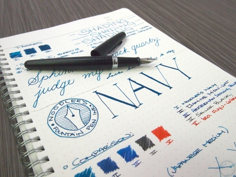
Pen: Franklin Christoph Model 65 – Fine S.I.G. Nib
Ink: Krishna Moonview
Paper: Rhodia, Code & Quill, Tomoe River

Ed Jelley_Krishna Moonview01088Review:

Last incowrimo truly introduced me to world of sheening inks. Until then I had heard about them but never ventured into that world myself. I had no idea one colour of ink could do so many things! When I first heard about Moonview earlier this year and saw some images I thought I would try it myself, and given it runs under $10 for a bottle, it was an easy decision to make.

Ed Jelley_Krishna Moonview1152Moonview is part of Krishna’s RC line of inks which is their high sheen line. The 20mL glass bottle comes in a plain cardboard box, which for me is perfectly fine, especially considering the price. A deeply saturated blue ink Moonview often looks completely pink due to how much it sheens. The blue is so deep, a night sky or twilight blue, it often looks black when it comes out of the nib. Flow is quite wet however the ink does tend to dry in the nib after a surprisingly short time, so you really need to keep capping and un-capping your pen to prevent hard starts. That, or never stop writing! I had the cap of my pen sneak open a few times which then requires a bit of scribbling to get writing again. Not the end of the world, but you probably won’t want to put this in anything that doesn’t have a solid seal or cap. I love showing off this ink to people who are new, or even not into pens and ink, as it makes such an impact on the viewer. One thing to note with this ink and others I’ve seen in this super sheeny world is they tend to smudge, even weeks later, with any amount of moisture. I’ve finished reading letters and wondered how the heck I got blue on my hands, only to realize half of the letter has come along for a ride. Krishna’s Moonview performs only slightly better in this area .

Ed Jelley_Krishna Moonview01092Let’s talk sheen, as this is probably the main reason you are considering this ink. Colour wise, the sheen is pink, and on Tomoe River the pink is the dominant colour that comes across when reading. Feeds become very pretty to look at with a fair bit of pink hanging on there as well. My daily paper at work is fairly absorbent, and even it shows off the pink sheen, which almost no other ink I use can do. Moonview also dries fairly quickly to reveal the sheen, so you don’t have to wait too long to see the final result. I’m still blown away by how much and how readily this ink sheens.
Being such a saturated ink, cleaning can be a little tricky, although nothing too awful. You may need to accelerate your cleaning schedule with this ink, as sitting seems to really let the colour sink in. I had some staining in an eyedropper pen, where the top of the ink level was, as well as a couple of cap threads, but I also had it in the pen for close to two months by that time. It was a pebbled interior so lots of nooks and crannies for the ink to get into. Converters also take a bit more effort to get the colour off of, but they are generally pretty easy to get at.

Ed Jelley_Krishna Moonview1158Pros:

– Deeply saturated ink
– Incredible amounts of sheen, even on surprising papers
– Very affordable price-point

Cons:

– Stubborn to clean
– Will almost always smudge, no matter how long it has dried
– Short bottle, may be tricky to fill some pens

Ed Jelley_Krishna Moonview01065Conclusion:

If you are new to sheening inks, or looking for a beautiful, deeply saturated blue, I think Krishna Moonview is a great place to start your search. The ink is quite wet, and cleans up relatively easily. Do keep in mind that it will almost always smudge with any amount of moisture, so long term or important writing may not be the best use case. For letters or quick notes I love this ink for it’s ability to add something special on almost any paper.

Gallery:


Advertisements

Jacques Herbin 1798: Kyanite du Nepal Ink Review

$
0
0

Jacques Herbin 1798: Kyanite du Nepal Ink Review


J Herbin Kyanite Du Nepal Ink Review-4

What is it? This new ink from Jacques Herbin (the ink maker formerly known as J. Herbin) is a medium shade of blue with a very fine silver shimmer particulate suspended in the ink. 

J Herbin Kyanite Du Nepal Ink Review-8

Notes: 

It’s that time of the year again. The weather gets warmer, the days get longer, and J. Herbin comes out with a new shimmery fountain pen ink. This year, they’ve introduced a brand new shade of turquoise that has silver shimmer throughout and a slight red sheen around the edges. It’s always fun checking out their newest ink, so let’s get into it. As always, photos in the gallery at the bottom of the post are sized so you can really zoom in. Make sure you take a look!

J Herbin Kyanite Du Nepal Ink Review-10

Let’s start off with the name of the ink. Kyanite du Nepal. It translates to Kyanite of Nepal (that was a bad joke, please laugh in the comments). The color of the ink draws inspiration from the kyanite crystal, a medium blue semiprecious mineral. What makes it even more interesting is that the crystal can naturally show signs of chatoyancy, which is a natural shimmer. Nepal is one of the premier sources for kyanite in the world, and it follows the travel theme that the past few inks have adhered to. The name is spot on and the ink does, in fact, represent the naturally occurring gemstone that it’s named after.

J Herbin Kyanite Du Nepal Ink Review-9

When writing (okay, it’s more like playing) around with a folded nib dip pen, the ink exhibits some nice shading and variation in tone. Both dark and light shades of turquoise are visible, with extra sheen in the areas where the ink goes down thicker. There’s just a tiny little hint of red sheen around some edges. I wouldn’t count on seeing that regularly unless there’s a LOT of ink on the page.

J Herbin Kyanite Du Nepal Ink Review-7

I loaded up my trusty Platinum 3776 Black Diamond with broad nib with some of the Kyanite. The ink flows really well, leaving a nice, wet line on the page. To get the maximum amount of sheen on the page, be sure to shake up the ink thoroughly (and carefully) to spread the particulate throughout the whole bottle. You can see some slight shading when writing with the fountain pen. The silver shimmer is definitely there when writing with a fountain pen. A broader nib will have better results. Kyanite du Nepal is a much brighter shade of blue compared to the older J. Herbin 1670 Bleu Ocean. Also worth noting, Bleu Ocean started out with no shimmer and was then given gold shimmer at a later date.

J Herbin Kyanite Du Nepal Ink Review-12

Overall, I’m a fan of the ink. It performs well, especially for an ink with shimmer in it. The color is great and it plays into the theme of the 1798 inks nicely. Thank you to Sunnny over at Exaclair for sending over the ink to review. It should be hitting shelves in June, so keep an eye out!

Gallery:


Viewing all 17 articles
Browse latest View live